After 2 years in the making The Clock 4 is finally here.
Over the next few days, I’m going to take you to a journey, unveiling the biggest update ever of The Clock, which leaded to The Clock 4.
I have a lot to cover. How much to cover you say? To give you an idea, The Clock 4 has around 100 optional settings to match your need.
Of course, I will not detail all of them, but I will unveil the major ones over the course of the next few days (~1 week). With at the end of this journey the release of the beta.
Before to describe all the redesign processes, struggles, issues, many times the rewrite of the code. In this first post, I will simply start slow. I will show the small UI differences between The Clock 3 and The Clock 4.
Big clarification before to start this journey. The Clock 4 refers to either the macOS version either the iOS version. As for a seamless experience, there is 99% features compatibility. Obviously not the menubar part 😉.
As you probably know The Clock is designed to be beautiful & simple yet a powerful productivity tool all at the same time.

The Clock is composed of 4 parts.
- The Calendar.
- What’s up next complication.
- The World Clocks area.
- The Meeting Planner Slider.
And these parts can be shown or hidden as per your need.
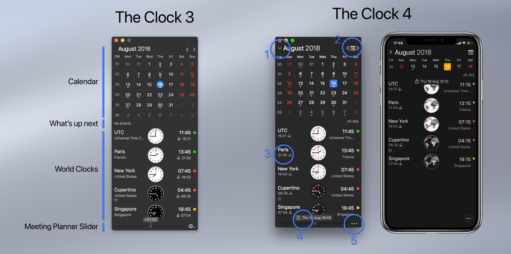
The Clock 4 of course retains this long time useful and loved UI, as you can see in the picture. But with small differences…
- The themes have a better color contrast. The font differents sizing are more inline with what you could see with the iOS Dynamic Type font sizes. The selected day is now with a nice rounded square.
- While the calendar is shown, you can now expand/collapse the calendar with 6 weeks (as before) or 1 week. Usuful for the smaller screens if you want still to see the calendar but do not want it to take too much space.
- The Go to Today button action has now its own Today button with the current date displayed. Previously you had to click on the month 🙁
- The world clocks complications (more than before) can now be placed on the left or right. The full complications list is avaiblable for both sides.
- The meeting planner slider panel now display the date/time directly in the panel. And the panel now have a share button clearly shown, to share your meeting information. Previously you had to click to get the contextual menu. Which was maybe not obvious.
- The gear button has been replaced by a “more” button for a consistent UI between macOS and iOS.
These are the major visual differences that you may notice when you open The Clock 4.
On the macOS version, you may not notice the following one…

Yes, on macOS, in the menu bar, now you can set your own custom format!
A little bit more:
- While panning to set a meeting, you are not limited anymore to +/- 24h. The Clock 4 will automatically continue and change the date in the calendar.
- You may not have noticed, but you can now change the analog clock design.
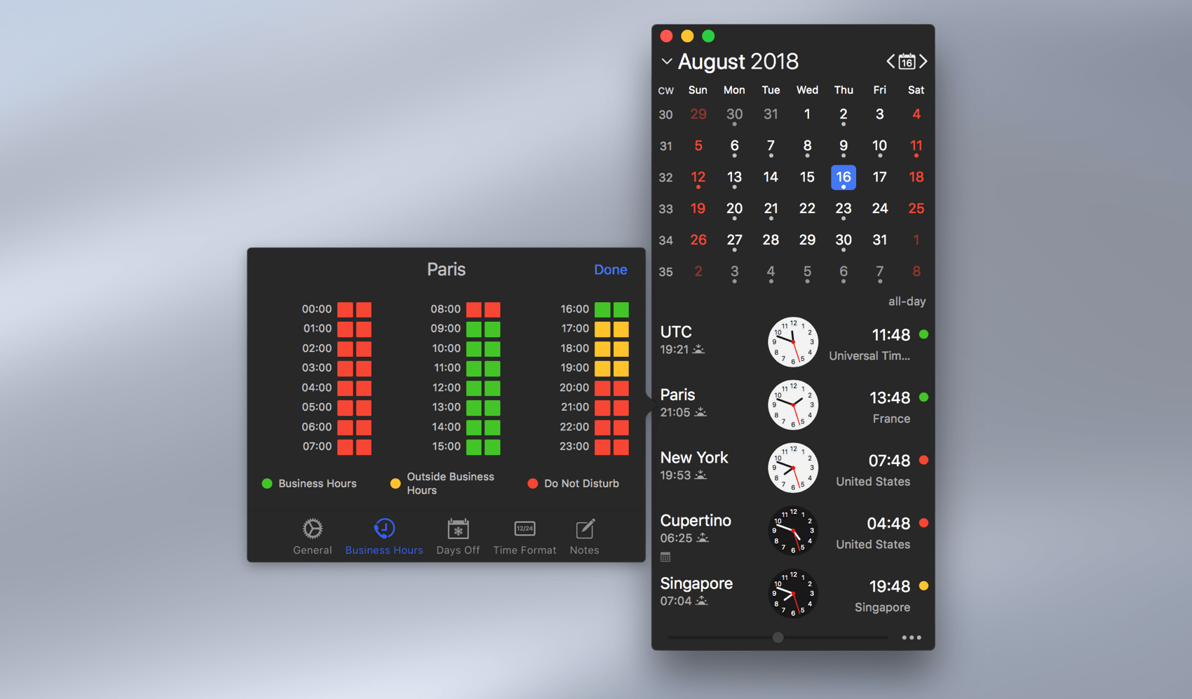
- And few other goodies such as the new redesigned World Clock settings for a consistent experience across your devices.

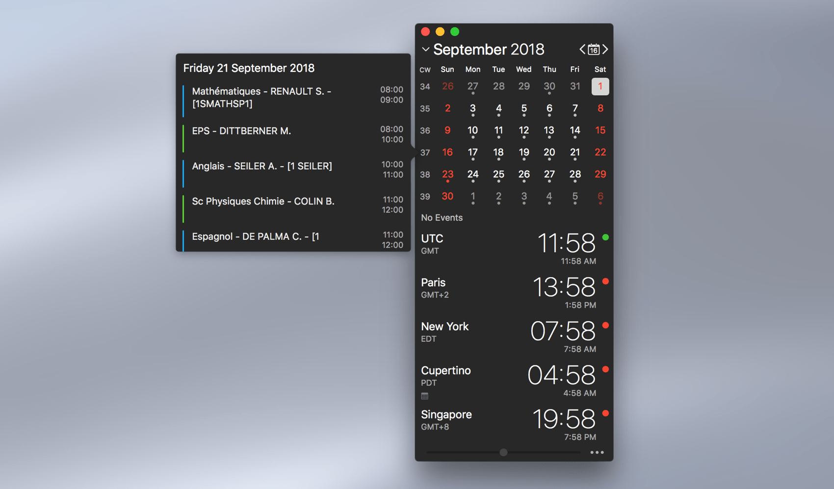
- Or the new redesigned calendar events.

The World Clock settings and Calendar events are now shown with a double click/double tap, in order to better align the gesture between macOS and iOS for the display of a popover panels.
These are really only a tiny part of the nice updates coming to The Clock 4. Be reminded that these blog posts will run for ~1 week. So I have far more to cover about this Bigger than Ever release.
Oh! before I forget. All this nice UI has been completely rewritten and is now driven 100% by Core Animation and Auto Layout for smooth animations and optimum rendering 🤪. And is macOS 10.14 Mojave and iOS 12 ready.
Little Game: A visual detail of The Clock 3/The Clock 4 macOS first screenshot has not been described yet, and it is a major one. Can you spot the differences between The Clock 3 and The Clock 4 macOS and tell me which one? 🤔.
Part 2 post to follow soon…